

Great design isn’t just art; it’s a calculated science. The Science of Brand Design is the formula for creating a visual identity that captivates minds and builds lasting connections.
The Science of Brand Design merges psychology, art, and strategy to forge a powerful brand identity. This guide explores the psychological triggers behind color and shape, the importance of typography and imagery, and how these elements combine to build trust, recognition, and brand equity.
Understanding The Science of Brand Design
What transforms a simple logo or color palette into an iconic brand identity? The answer lies in The Science of Brand Design. This discipline is not about subjective artistic preference; it is a strategic fusion of psychology, neuroscience, and design principles aimed at evoking specific emotions and creating cognitive shortcuts in the minds of consumers. It is the deliberate process of crafting a visual language that communicates a brand’s purpose, personality, and promise without uttering a single word.
At its heart, The Science of Brand Design acknowledges that humans are visual creatures who make snap judgments. Our brains are wired to process images and symbols far more rapidly than text. This is why a brand’s visual identity—its logo, colors, typography, and imagery—serves as the primary handshake with its audience. It sets the tone for the entire relationship and begins to shape Brand Perception in Marketing. A well-executed design feels intuitive and right, while a poorly conceived one can create feelings of distrust, confusion, or indifference.
This comprehensive field involves understanding Neuromarketing Techniques—how the brain responds to different visual stimuli. It delves into The Psychology of Color in Branding, the emotional weight of different fonts, and the narrative power of shapes. The Science of Brand Design is what enables a brand like Apple to be perceived as sleek, innovative, and user-friendly before a customer even touches a product. It’s how Coca-Cola’s specific shade of red and Spencerian script can trigger feelings of happiness and Nostalgia in Digital Branding. It is a calculated, repeatable process for building a memorable and effective brand.
The Psychology Behind Brand Design: Why We Feel What We See
To master The Science of Brand Design, one must first understand the predictable ways in which the human brain interprets visual information. Our reactions to design are rooted in a combination of evolutionary psychology, cultural associations, and personal experiences.
The Power of First Impressions and Visual Heuristics
The brain uses heuristics, or mental shortcuts, to make decisions quickly. A brand’s visual design is a powerful heuristic. When a consumer encounters a new brand, its design is the first piece of data they process. A professional, cohesive design creates a “halo effect,” leading the consumer to assume that the products and services offered are also of high quality. This is a foundational principle of The Science of Brand Design. Conversely, an amateurish or inconsistent design can immediately signal untrustworthiness, regardless of the actual quality of the product.
The Gestalt Principles in Design
The Gestalt principles of psychology describe how humans naturally group visual elements to perceive a unified whole. These principles are fundamental to The Science of Brand Design.
- Proximity: Objects that are close together are perceived as a group. In design, this is used to group related information, making layouts easier to understand.
- Similarity: Elements that look similar are perceived as being related. This is why brand elements, like icons and buttons, share a consistent style.
- Continuity: The eye tends to follow lines and curves. This principle is used to guide the viewer’s eye through a design in a specific path.
- Closure: The brain will fill in the missing parts of a design to create a whole. The famous logos of USA Network and Adobe use this principle to create engaging and memorable marks.
- Figure/Ground: The eye separates an object (figure) from its surrounding area (ground). This can be used to create clever designs with dual meanings, like the FedEx logo’s hidden arrow.
By leveraging these principles, The Science of Brand Design creates visual identities that are not just aesthetically pleasing but also cognitively easy to process, which enhances memorability and positive association.
Emotional Branding and The Limbic System
Decision-making is not a purely logical process. The Neuroscience of Brand Loyalty shows that the limbic system, the emotional center of the brain, plays a huge role. Emotional Branding aims to create a design that speaks directly to this part of the brain. The choice of colors, the style of photography, and the overall mood of the design are all calibrated to evoke specific feelings—joy, security, excitement, or trust. The Science of Brand Design is about triggering the right emotions to forge a deeper, more resilient connection with the consumer.
Key Elements of Effective Brand Design
A powerful brand identity is built from several core visual components. The Science of Brand Design dictates that these elements must not only be strong individually but also work together in harmony.
1. Logo and Brand Mark
The logo is the cornerstone of your visual identity. It can be a wordmark (like Google), a Brand Mark in Marketing (like the Nike swoosh), or a combination. The science here involves creating a mark that is:
- Simple: Easy to recognize and remember.
- Memorable: Distinctive enough to stand out.
- Timeless: Avoids trends that will quickly become dated.
- Versatile: Works across different sizes and applications.
- Appropriate: Aligns with the brand’s industry and personality.
2. Color Palette
Color is one of the most powerful tools in The Science of Brand Design. It can influence mood, attract attention, and communicate meaning in an instant. A brand’s color palette should be consistent and strategically chosen.
3. Typography
Typography is the art of arranging type. The fonts you choose have a distinct personality.
- Serif Fonts (like Times New Roman): Have small feet at the end of their strokes. They often convey tradition, reliability, and respectability. They are popular with financial institutions and universities.
- Sans-Serif Fonts (like Helvetica or Arial): Lack the small feet. They are perceived as modern, clean, and straightforward. Tech companies and startups heavily favor them.
- Script Fonts: Mimic cursive handwriting. They can suggest elegance, creativity, and a personal touch.
- Display Fonts: Are highly stylized and meant to grab attention. They are best used for headlines and not for long blocks of text.
Effective typography in The Science of Brand Design involves selecting a primary and secondary font that are legible and reflect the Brand Personality in Marketing.
4. Imagery and Iconography
The style of photography, illustration, and icons you use is a critical part of your brand’s visual language. Is your photography bright and optimistic, or is it moody and atmospheric? Are your illustrations hand-drawn and whimsical, or are they precise and geometric? This imagery must be consistent and reinforce the overall brand story.
5. Composition and Layout
How you arrange these elements on a page—your website, a brochure, a social media post—is also part of The Science of Brand Design. A good layout uses principles like visual hierarchy (guiding the eye to the most important information first), white space (to avoid a cluttered look and improve readability), and balance to create a composition that is both beautiful and functional. This is a key part of User Experience and Branding.
The Deep Science of Color, Typography, and Shape
Let’s delve deeper into the specific psychological impacts of these core design elements.
The Psychology of Color in Branding
Color is not just decoration; it’s a communication tool. The Science of Brand Design leverages a field known as color psychology to elicit specific reactions.
|
Color |
Common Psychological Associations |
Industries/Brands That Use It |
|---|---|---|
|
Red |
Energy, passion, urgency, excitement, danger |
Coca-Cola, Netflix, Target |
|
Blue |
Trust, stability, calmness, intelligence, professionalism |
Facebook, IBM, Chase Bank, Ford |
|
Green |
Nature, health, growth, wealth, sustainability |
Whole Foods, John Deere, Starbucks |
|
Yellow |
Optimism, happiness, warmth, clarity, attention-grabbing |
McDonald’s, IKEA, Snapchat |
|
Orange |
Enthusiasm, creativity, friendliness, confidence |
The Home Depot, Nickelodeon, Fanta |
|
Purple |
Royalty, luxury, wisdom, creativity, imagination |
Cadbury, Hallmark, Yahoo |
|
Black |
Power, elegance, sophistication, authority, mystery |
Chanel, Nike, Adidas, The New York Times |
|
White/Silver |
Cleanliness, simplicity, purity, modernity |
Apple, Tesla |
It’s important to note that color associations can vary across cultures. A key part of Global Brand Localization is researching local color meanings to avoid unintended messages. The Science of Brand Design is about using color deliberately to reinforce your brand’s intended perception.
The Subconscious Impact of Typography
The choice of font affects readability, but it also sets a powerful emotional tone. The Science of Brand Design uses typography to communicate personality subconsciously.
- Round, soft fonts can feel friendly, approachable, and even youthful.
- Sharp, angular fonts can convey strength, precision, and modernity.
- Tall, condensed fonts can feel elegant and aspirational.
- Heavy, bold fonts communicate power and importance.
The spacing between letters (kerning) and lines (leading) also plays a role. Generous spacing can create a feeling of luxury and calm, while tight spacing can feel urgent or crowded.
The Hidden Language of Shapes
Shapes also carry innate psychological meaning, a concept central to The Science of Brand Design.
- Circles, Ovals, and Ellipses: These shapes are associated with community, unity, friendship, and love. Their lack of sharp angles makes them feel soft, safe, and inviting. The Olympic rings and the Target logo are excellent examples.
- Squares and Rectangles: These shapes communicate stability, reliability, and order. Their straight lines and right angles suggest structure and professionalism. Microsoft and American Express use these shapes to convey trustworthiness.
- Triangles: Triangles can symbolize power, science, religion, and law. When pointing up, they suggest stability and momentum. When pointing down, they can feel dynamic and in motion. The Adidas and Mitsubishi logos use triangles effectively.
- Vertical Lines: Communicate strength, power, and dominance.
- Horizontal Lines: Suggest calmness, tranquility, and community.
The Science of Brand Design involves selecting and combining these shapes in a logo and overall visual system to construct a specific, non-verbal message about the brand.
How to Create a Cohesive Brand Identity: The Brand Style Guide

A brand’s design is only effective if it is consistent. A Brand Style Guide (also known as a brand book or brand guidelines) is the single source of truth for your visual identity. It’s the practical application of The Science of Brand Design. This document ensures that every piece of communication, from a business card to a Super Bowl ad, is consistent.
A comprehensive style guide should include:
- Brand Strategy Overview: A brief on your mission, vision, values, and Brand Personality in Marketing.
- Logo Guidelines:
-
- The primary logo and any secondary versions.
- Clear space rules (how much “breathing room” to leave around the logo).
- Minimum size requirements.
- Examples of incorrect usage (e.g., don’t stretch, recolor, or alter the logo).
- Color Palette:
- Your primary and secondary brand colors.
- Specific color codes for print (Pantone, CMYK) and digital (RGB, Hex).
- Typography Guidelines:
- Your headline and body copy fonts.
- Font weights and sizes for different applications.
- Rules for spacing and alignment.
- Imagery and Iconography Style:
- Guidelines for the mood, tone, and subject matter of photography.
- Rules for illustration style.
- A library of custom icons.
- Brand Voice: Guidelines on the tone and style of written communication.
Building Brand Consistency Across Digital and Physical Touchpoints is impossible without a style guide. It empowers your team and external partners to apply The Science of Brand Design correctly, reinforcing your brand identity at every touchpoint.
The Role of Technology in Modern Brand Design
The Science of Brand Design is continually evolving with technology.
- AI-Powered Brand Analysis: AI tools can now analyze thousands of brand designs to identify patterns and predict the success of new logos. They can also conduct AI-Powered Brand Analysis on social media to gauge real-time Brand Perception in Marketing based on visual mentions.
- Generative Design: AI can generate hundreds of design variations based on a set of strategic inputs, accelerating the creative process.
- Augmented Reality Branding: AR allows brands to overlay their visual identity onto the real world through a user’s phone, creating immersive and interactive experiences.
- AI Sensory Branding: Beyond visuals, technology is enabling a new frontier of Sensory Branding. The Power of Sonic Branding (audio logos like Intel’s) and even haptic feedback (vibrations in a device) are becoming part of a brand’s designed identity.
These technologies are adding new layers to The Science of Brand Design, allowing for more dynamic, personalized, and multi-sensory brand experiences.
Case Studies: The Science of Brand Design in Practice
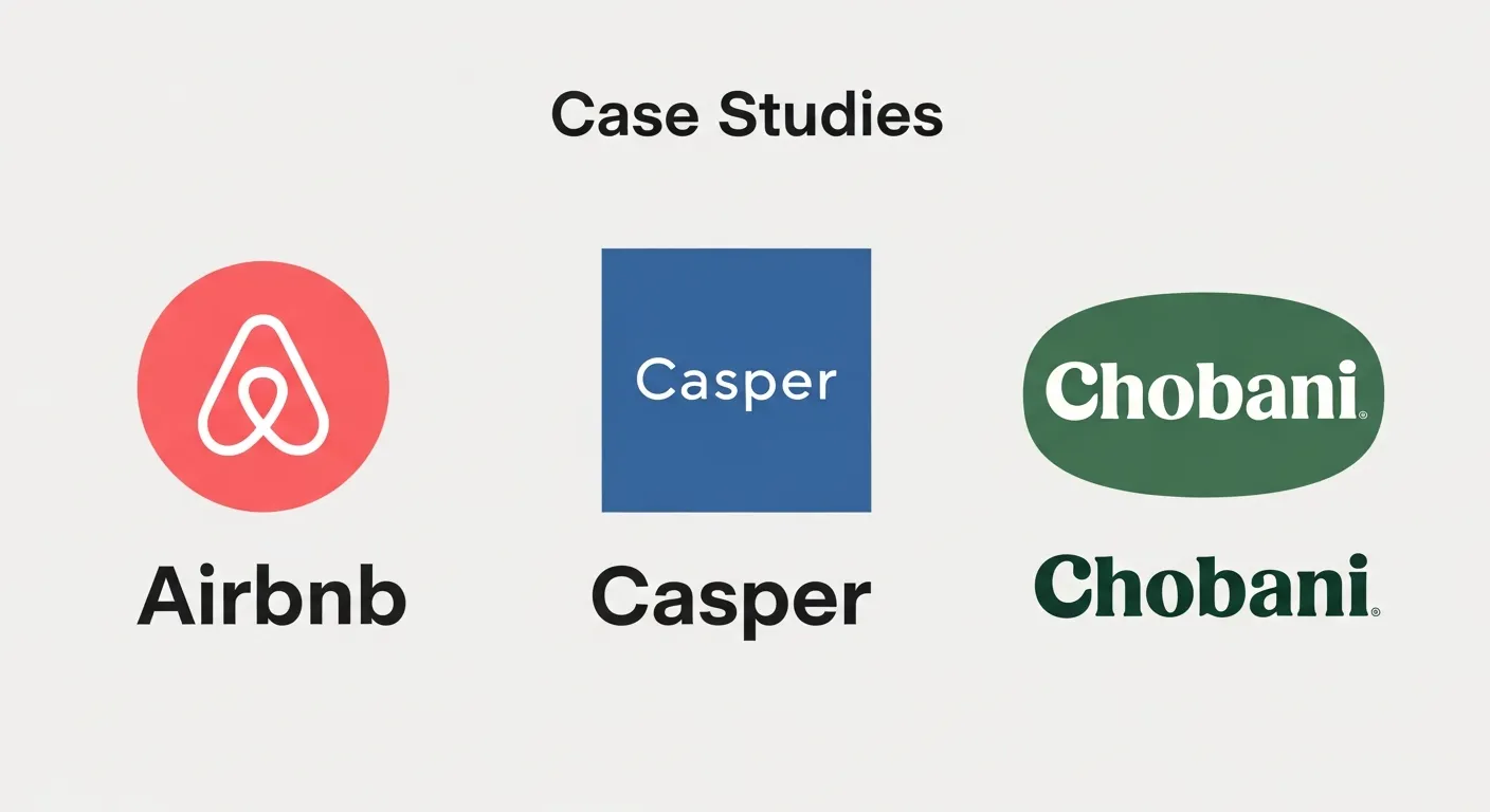
1. Airbnb: From Ambiguous to Belonging
Airbnb’s original logo was a simple, bubbly wordmark that did little to communicate its brand purpose. In 2014, they underwent a major rebrand, introducing the “Bélo,” an abstract symbol meant to represent people, places, love, and the “A” of Airbnb. The Science of Brand Design was evident in their choice of a soft, rounded, continuous-loop shape, evoking feelings of community and connection. The accompanying color, a vibrant coral named “Rausch,” was chosen for its association with passion and energy. This strategic redesign transformed their brand identity, aligning it with their core mission of “Belong Anywhere.”
2. Casper: Designing for Simplicity and Trust
The mattress industry was traditionally complex and high-pressure. Casper disrupted it with a simplified product offering and a brand design to match. The Science of Brand Design they employed was one of minimalism and calm. Their color palette is dominated by a calming, trustworthy blue. Their typography is clean and sans-serif, communicating clarity and honesty. Their imagery is bright, airy, and features diverse but relatable people. Every design element works in concert to communicate ease, transparency, and comfort, directly addressing the pain points of the traditional mattress-buying experience.
3. Chobani: A Shift to Warmth and Naturalness
Chobani’s initial design was typical of the Greek yogurt category—stark white packaging with a blocky, sans-serif font. It felt clinical. In their 2017 rebrand, they embraced The Science of Brand Design to communicate a more natural and craft-oriented feeling. They adopted a new custom serif font with soft, rounded edges, giving it a friendly, almost retro feel. Their new color palette was inspired by nature—earthy tones and off-whites. The photography became more rustic and focused on whole fruit. This complete visual overhaul shifted their Brand Perception in Marketing from a mass-market product to a wholesome, natural food brand.
Conclusion
The Science of Brand Design is the invisible force that shapes our connection to the brands we love. It is a meticulous discipline that transforms strategy into a tangible visual language of color, shape, and typography. By understanding the psychological principles that govern how we interpret design, businesses can move beyond mere aesthetics and craft an identity that builds trust, fosters recognition, and drives loyalty. A successful brand is not just seen; it is felt and understood on a subconscious level. This is the ultimate power and purpose of applying The Science of Brand Design.
FAQs
1. What is the first step in the science of brand design?
The first step is always strategy, not sketching. Before any visual work begins, you must conduct a deep dive to define your brand’s purpose, values, audience, and personality. The Science of Brand Design is ineffective without a solid strategic foundation.
2. How is The Science of Brand Design different from just graphic design?
Graphic design is the skill of creating visuals. The Science of Brand Design is the strategic application of psychological principles and marketing goals to those visuals. It’s the “why” behind the “what,” ensuring the design achieves a specific business objective.
3. How do you measure the effectiveness of brand design?
Effectiveness can be measured through Brand Awareness surveys (testing brand recognition from the logo alone), A/B testing different design elements on a website to see which converts better, and monitoring social media sentiment. A successful design should lead to improved recognition, recall, and positive Brand Perception in Marketing.
4. Can a small business apply The Science of Brand Design?
Absolutely. The principles are universal. A small business can apply The Science of Brand Design by making deliberate choices about their logo, colors, and fonts that align with their brand personality and appeal to their target audience, even with a small budget.
5. Why is consistency so important in brand design?
Consistency builds trust and recognition. The human brain craves patterns. When a brand’s visual elements are consistent, it becomes familiar. This familiarity creates a sense of reliability and makes the brand easier to remember. Inconsistency creates cognitive dissonance and confusion.
6. What role do Brand Archetypes play in brand design?
Brand Archetypes (e.g., The Hero, The Ruler, The Jester) provide a personality framework that guides design choices. A “Ruler” brand (like Mercedes-Benz) would use a design language of structure, power, and elegance, while a “Jester” brand (like M&M’s) would use bright colors and playful typography. It’s a key tool in The Science of Brand Design.
7. How does culture affect the interpretation of brand design?
Visual symbols and colors can have vastly different meanings across cultures. For example, white is associated with purity and weddings in Western cultures, but it’s the color of mourning in many Eastern cultures. The Science of Brand Design for a global brand must include research into these cultural nuances.
8. What is Sensory Branding?
Sensory Branding is an extension of visual design that engages multiple senses. It includes the sound of a brand’s jingle (Sonic Branding), the specific scent of a retail store, or the tactile feel of a product’s packaging. It creates a more immersive and memorable brand experience.
9. Should my brand design follow current trends?
It’s risky. While it’s important to look modern, chasing trends can make your brand look dated very quickly once the trend passes. The best application of The Science of Brand Design is to create a timeless identity that can endure for years with only minor refreshes.
10. Can a good product succeed with bad brand design?
It’s possible but incredibly difficult. A great product with poor design has to work much harder to overcome the initial negative impression and build trust. Good design acts as a lubricant for the entire business, making every marketing effort more effective and every customer interaction smoother.


