

A powerful symbol can speak volumes. In the visual language of business, a Brand Mark in Marketing is your most concise and memorable statement.
A Brand Mark in Marketing is the unique, non-textual symbol or design that identifies a company. This guide explores its crucial role in creating instant recognition, details different types of brand marks, and provides a strategic framework for designing an effective one that builds brand equity.
Defining the Brand Mark in Marketing
In the vast lexicon of branding, terms are often used interchangeably, leading to confusion. So, What is a Brand Mark in Marketing? At its most fundamental level, a brand mark is the part of a brand that is purely visual—a symbol, design, or distinctive coloring and lettering that is not made of words. Think of the Nike “swoosh,” Apple’s bitten apple, or Target’s bullseye. You don’t need to see the company’s name to know who they are. That immediate, wordless recognition is the power of a successful Brand Mark in Marketing.
It’s crucial to distinguish a Brand Mark in Marketing from a brand name. A brand name is the part of a brand that can be vocalized, like “Coca-Cola” or “Amazon.” The brand mark is the visual element that often accompanies it. Together, the brand mark and brand name form the logo. Sometimes, a brand’s name is designed in a unique, stylized way, which is called a logotype (or wordmark), like the logos for Google or FedEx. When the visual element stands alone, it is a pure Brand Mark in Marketing.
The primary purpose of a Brand Mark in Marketing is to create a mental shortcut in the consumer’s mind. The human brain processes images 60,000 times faster than text. This makes a visual identifier an incredibly efficient tool for building Brand Recognition in Marketing. When a consumer is scanning a crowded supermarket aisle or scrolling through a busy social media feed, a familiar brand mark can cut through the noise instantly, triggering all the associated feelings and experiences related to that brand. This function is a core component of building Brand Equity in Marketing. A strong mark becomes a valuable asset, representing the goodwill and reputation the company has built over time.
The Critical Importance of a Brand Mark in Marketing

In a marketplace saturated with competitors, a distinctive Brand Mark in Marketing is not a “nice-to-have”; it is an essential pillar of a robust Brand Strategy. Its importance can be broken down into several key areas:
1. Fostering Instant Recognition and Recall
The most significant benefit of a Brand Mark in Marketing is its ability to be recognized instantly. A well-designed mark is memorable and easy to recall. This is vital in today’s fast-paced environment where consumers make split-second decisions. This immediate identification helps to increase Brand Awareness in Marketing and ensures that your brand remains top-of-mind.
2. Overcoming Language Barriers
In our increasingly globalized world, a Brand Mark in Marketing is a universal language. The McDonald’s Golden Arches are understood from Tokyo to Toronto, regardless of the local language. For companies aiming for Global Brand Localization, a strong visual mark is invaluable. It transcends linguistic and cultural boundaries, providing a consistent point of recognition worldwide.
3. Communicating Brand Personality and Values
A Brand Mark in Marketing is a powerful vehicle for communication. Through color, shape, and imagery, it can convey a brand’s core values and personality. The Psychology of Color in Branding suggests that blue can imply trust and stability, while green often signals nature and sustainability. A sharp, angular mark might suggest modernity and precision, whereas a soft, rounded one can evoke friendliness and community. This visual storytelling helps shape Brand Perception in Marketing.
4. Creating Differentiation
In a crowded market, your Brand Mark in Marketing is a key differentiator. It visually separates you from your competitors. Consider the automotive industry, where the brand marks of Mercedes-Benz, BMW, and Audi are instantly distinguishable and communicate different brand promises. This visual distinction is fundamental to achieving strong Brand Positioning in Marketing.
5. Building Trust and Credibility
A professional, well-conceived Brand Mark in Marketing signals quality and legitimacy. It suggests that the company is established and takes itself seriously. This subconscious cue helps to build trust with consumers, making them more likely to engage with the brand. It acts as a seal of approval, a consistent sign of the quality they can expect.
Types of Brand Marks
The term Brand Mark in Marketing encompasses several categories of visual identifiers. Understanding these types is crucial when developing your own branding.
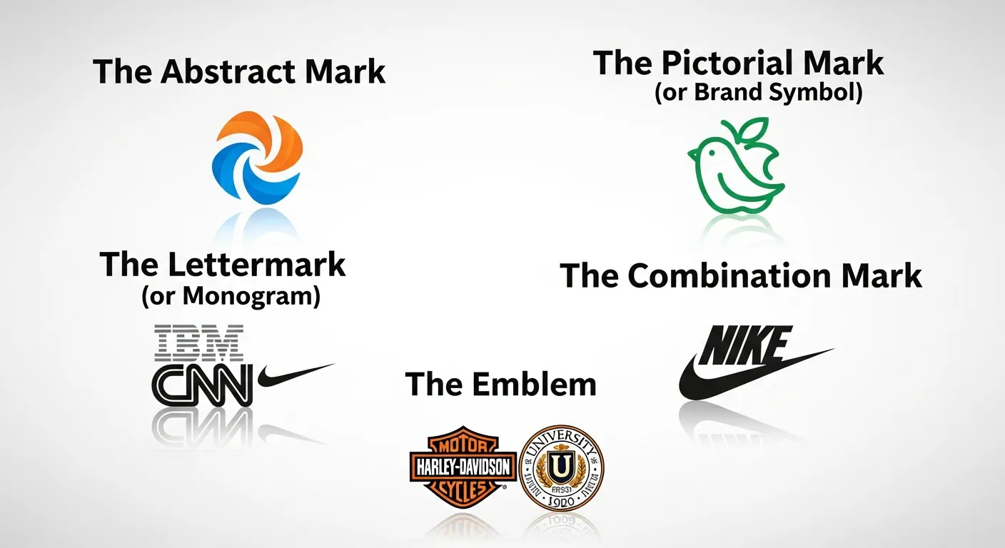
1. The Abstract Mark
An abstract mark is a unique geometric form that doesn’t represent a recognizable object but is created specifically for the brand. The Nike swoosh and the Pepsi divide are prime examples.
- Pros: Highly unique and ownable. Because it is custom, it can be heavily protected by trademark and becomes exclusively associated with the brand.
- Cons: Requires significant marketing investment to build recognition. Since the mark has no inherent meaning, the brand must teach consumers what it stands for.
2. The Pictorial Mark (or Brand Symbol)
This is a graphic icon or symbol that represents a real-world object. The Apple logo is a pictorial mark of an apple, and Twitter’s logo is a bird.
- Pros: Can be easily recognizable and create a simple, direct association (e.g., Twitter’s bird represents “tweeting” or sending short messages).
- Cons: The chosen object could be too literal, limiting the brand if it decides to expand into different industries. For example, a logo of a book might not work well if the company starts selling electronics.
3. The Lettermark (or Monogram)
A lettermark is a typography-based logo that is comprised of a few letters, usually the company’s initials. Examples include HBO (Home Box Office), NASA (National Aeronautics and Space Administration), and IBM (International Business Machines).
- Pros: Excellent for businesses with long names. The monogram is a simple, memorable, and easily scalable Brand Mark in Marketing.
- Cons: Not ideal for new businesses that need to build name recognition. Without a clear connection to the full name, it can be confusing for new audiences.
4. The Combination Mark
This type of logo combines a wordmark with a pictorial mark, abstract mark, or lettermark. The elements can be laid out side-by-side, stacked on top of each other, or integrated together. Examples include Adidas, Doritos, and Lacoste.
- Pros: Highly versatile. The brand can use the mark and text together or separately depending on the context. This helps build stronger Brand Recognition in Marketing because the name is directly associated with the visual.
- Cons: Can sometimes feel cluttered if not designed well. A complex combination mark may not scale down well for small applications like favicons.
5. The Emblem
An emblem consists of font inside a symbol or an icon; think of badges, seals, and crests. These logos tend to have a traditional appearance that can communicate longevity and quality. Examples include the Starbucks siren emblem and the Harley-Davidson Motor Company logo.
- Pros: Creates a perception of tradition, stability, and high quality.
- Cons: Can be less versatile than other logo types. The level of detail in many emblems makes them difficult to reproduce at small sizes.
Here is a table summarizing the different types:
|
Type of Brand Mark |
Description |
Prime Example |
Best For |
|---|---|---|---|
|
Abstract Mark |
A unique geometric symbol with no direct real-world meaning. |
Nike Swoosh |
Brands wanting a highly unique and scalable identifier. |
|
Pictorial Mark |
An icon or graphic representing a recognizable object. |
Apple’s Apple |
Brands with a strong, literal connection to a single object. |
|
Lettermark |
A typography-based mark using the company’s initials. |
HBO |
Companies with long or difficult-to-pronounce names. |
|
Combination Mark |
A mix of a symbol and a wordmark. |
Adidas |
Most businesses, as it offers versatility and builds strong association. |
|
Emblem |
A design where the name is integrated into a symbol or shape. |
Starbucks |
Brands wanting to project tradition, quality, and authority. |
How to Create an Effective Brand Mark in Marketing

Designing a powerful Brand Mark in Marketing is a strategic process that goes far beyond simple aesthetics. It involves research, creativity, and a deep understanding of your brand’s core identity.
Step 1: Deep Dive into Brand Strategy
Before you even think about design, you must have a clear Brand Strategy Framework.
- Define Your Purpose: Why does your company exist beyond making money? A clear brand purpose will guide the design process.
- Know Your Audience: Who are you trying to reach? A Brand Mark in Marketing for a luxury brand aimed at retirees will look very different from one for a tech startup targeting Gen Z.
- Analyze Competitors: Conduct a Competitive Brand Analysis. What do their brand marks look like? Your goal is to stand out, not blend in. Look for visual trends in your industry and decide if you want to follow or break them.
- Identify Your Brand Personality: Use Brand Archetypes to define your brand’s character. Are you The Jester (fun, playful) or The Sage (wise, knowledgeable)? The personality should be reflected in the design.
Step 2: Brainstorming Concepts and Keywords
Based on your strategy, create a list of keywords and concepts that describe your brand. If you are a sustainable energy company, words like “clean,” “future,” “cycle,” and “earth” might come to mind. These words will serve as creative fuel for the visual design. Mastering Brand Storytelling begins here, by finding the central theme you want your mark to communicate.
Step 3: Sketching and Ideation
This is where the visual creation begins. A professional designer will typically sketch hundreds of ideas. The goal is not perfection but exploration. Explore different types of marks—pictorial, abstract, etc. Don’t settle on the first good idea. The most effective Brand Mark in Marketing often emerges after extensive iteration. The Psychology of Brand Design is critical here; shapes and lines carry subconscious meaning.
Step 4: Adhering to the Principles of Effective Design
A great Brand Mark in Marketing adheres to several key principles:
- Simplicity: The best marks are simple and clean. A simple design is easy to recognize, remember, and reproduce across various media.
- Memorability: Is it distinctive? Will a customer remember it after a single glance? Uniqueness is paramount.
- Timelessness: Avoid trendy design elements that will look dated in a few years. A strong Brand Mark in Marketing should have longevity. The Coca-Cola and Ford logos have remained effective for over a century with only minor updates.
- Versatility: It must work in various sizes and contexts. It should be effective in black and white as well as in color. It needs to look good on a giant billboard and as a tiny app icon.
- Appropriateness: The design must be appropriate for its intended audience and industry. A cartoonish font is great for a toy company but not for a law firm.
Step 5: Testing and Gathering Feedback
Once you have narrowed down the options to a few strong contenders, it’s time to test them. Show them to a sample of your target audience. Ask them what feelings or words the mark evokes. Does it align with your intended Brand Personality in Marketing? This feedback is invaluable for making the final decision and avoiding a costly mistake. Don’t rely solely on your own opinion or your internal team’s preferences.
The Role of a Brand Mark in Digital Marketing

In the digital realm, a Brand Mark in Marketing takes on new levels of importance and new technical requirements.
The Tiny Icon: Scalability is King
Your brand mark will appear as a social media profile picture, a website favicon, and an app icon. In these contexts, it is often just a few dozen pixels in size. A complex or detailed Brand Mark in Marketing, especially an emblem, can become an unrecognizable smudge. This is why simple, bold marks like those of Target or Netflix excel in the digital space. When designing, you must constantly ask: “Will this scale?”
Animated Logos and Sensory Branding
Digital platforms allow for animation. An animated Brand Mark in Marketing can add a layer of personality and storytelling. Think of the Google logo morphing into different shapes or the Netflix “ta-dum” sound accompanying its animated mark. This is a form of Sensory Branding that creates a richer, more memorable experience. The Power of Sonic Branding (audio logos) is increasingly being paired with visual marks.
Building Brand Consistency Across Channels
Your Brand Mark in Marketing is the anchor of your visual identity across a multitude of digital touchpoints—your website, email campaigns, social media profiles, and digital ads. Building Brand Consistency Across Digital and Physical Touchpoints is vital for creating a cohesive brand experience. A digital asset management (DAM) system can help ensure that everyone in your organization is using the correct version of the brand mark, maintaining consistency.
Influencer Marketing and User-Generated Content
When influencers or customers share content featuring your product, your Brand Mark in Marketing often appears in their photos and videos. A clear and recognizable mark ensures that your brand gets credit and exposure, even when the content is not created by you. This organic exposure is a key part of modern Digital Marketing Strategies.
Case Studies: Iconic Brand Marks in Action
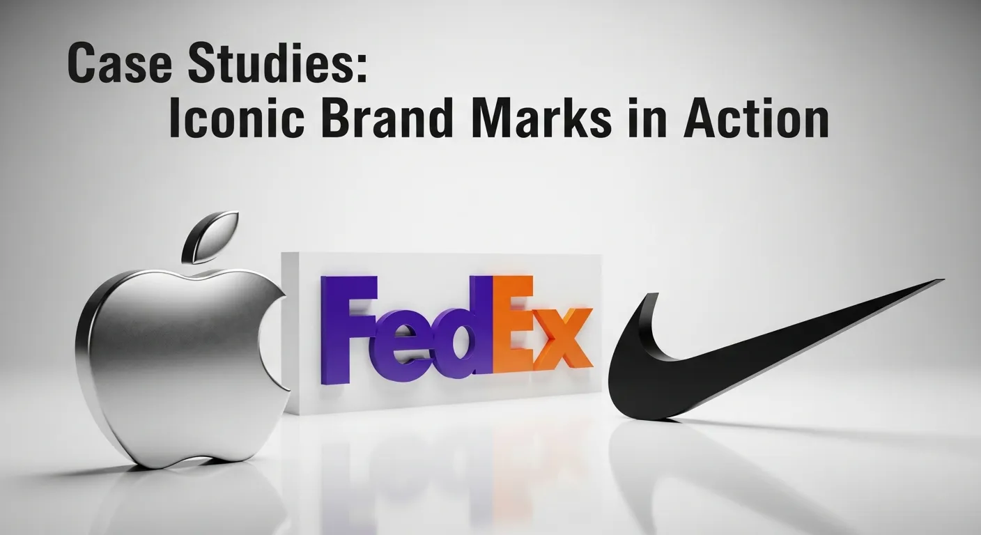
1. Apple: The Power of Simplicity and Evolution
The original Apple logo from 1976 was a complex emblem featuring Isaac Newton under an apple tree. It was intricate and difficult to reproduce. Recognizing this, Steve Jobs commissioned a new logo the following year—the now-famous bitten apple. The pictorial mark was simple, modern, and scalable. The “bite” was added to ensure it wasn’t mistaken for a cherry and added a playful, human element. This evolution demonstrates the importance of moving from a complex to a simple Brand Mark in Marketing to achieve iconic status.
2. FedEx: Hidden Meaning and Brilliance
The FedEx logo appears to be a simple wordmark. However, hidden in the negative space between the “E” and “x” is a perfect arrow. This arrow subconsciously communicates speed, precision, and forward movement—all core values of the FedEx brand. It is a masterclass in creating a Brand Mark in Marketing with a deeper layer of meaning that adds to its effectiveness without cluttering the design.
3. Nike: The Billion-Dollar Swoosh
The Nike “swoosh” is perhaps the most famous abstract Brand Mark in Marketing in the world. Designed in 1971 for just $35, it represents motion and speed, inspired by the wing of the Greek goddess of victory, Nike. The company invested heavily in associating this simple abstract shape with top athletes and inspirational messages of achievement. Today, the swoosh is so powerful that Nike often doesn’t even need to include its brand name in advertisements.
Conclusion
A Brand Mark in Marketing is far more than just a pretty picture; it is the face of your company, a vessel for your reputation, and a powerful tool for building a lasting connection with your audience. It is a strategic asset that works tirelessly to differentiate your brand, communicate your values, and foster instant recognition in a noisy world. By understanding its importance and following a strategic design process, you can create a mark that not only looks good but also drives business growth and builds enduring brand equity for years to come.
FAQs
1. What’s the difference between a logo and a brand mark?
A logo is the complete identifier for a brand, which can include text and symbols. A Brand Mark in Marketing is specifically the symbolic, non-textual part of the logo. For example, the Lacoste logo is a combination of the crocodile symbol (the brand mark) and the “Lacoste” wordmark. The crocodile alone is the brand mark.
2. Can my company just use a wordmark instead of a brand mark?
Yes, many successful brands use only a wordmark (logotype), such as Coca-Cola, Google, and Visa. This is a viable strategy, especially if the company name is short, memorable, and distinctive. The unique typography itself becomes the visual identifier.
3. How much should I expect to pay for a professional brand mark?
The cost of designing a Brand Mark in Marketing can range dramatically, from a few hundred dollars on a freelance platform to tens of thousands of dollars with a professional branding agency. The price reflects the depth of research, strategy, and design exploration involved. It is an investment in a core business asset.
4. How do I legally protect my brand mark?
You can protect your Brand Mark in Marketing by registering it as a trademark with the appropriate government body, such as the U.S. Patent and Trademark Office (USPTO). This gives you exclusive rights to use the mark in connection with your goods or services and prevents others from using a confusingly similar mark.
5. Should my brand mark explain what my company does?
Not necessarily. While a pictorial mark can be literal (e.g., a house for a real estate company), many of the world’s most powerful brand marks are abstract (like the Nike swoosh) and have no inherent meaning. Their meaning is built over time through marketing and brand experience.
6. How often should a company update its brand mark?
A great Brand Mark in Marketing is timeless and should not require frequent changes. However, a Brand Refresh (a minor update) every 5-10 years can keep it looking modern and relevant without losing its core recognition. Major rebrands should be rare and undertaken only when there is a significant shift in the company’s strategy or identity.
7. What makes a brand mark “timeless”?
A timeless Brand Mark in Marketing avoids trendy fonts, colors, or effects. It relies on strong, simple forms, a balanced composition, and a core concept that is not tied to a specific moment in time. The logos for major brands like Ford, Chanel, and Shell have remained effective for decades because of their fundamental simplicity.
8. Can a color be part of a brand mark?
Yes, color is a critical component of a Brand Mark in Marketing. Some companies have even been able to trademark a specific color in their industry, such as Tiffany & Co.’s robin’s egg blue or T-Mobile’s magenta. This makes the color itself a powerful brand identifier.
9. What is a “dynamic brand mark”?
A dynamic Brand Mark in Marketing is one that changes its appearance in different contexts while maintaining a consistent underlying structure. The MTV logo is a classic example, where the core “M” shape is filled with different patterns, colors, and textures. This approach allows the brand to feel fresh and adaptable.
10. Does a personal brand need a brand mark?
For many professionals building a personal brand, their name and photograph serve as their primary identifiers. However, creating a simple lettermark or a unique personal logo can help create a more professional and cohesive visual identity across websites, social media, and business cards, enhancing the overall Personal Brand Strategy.


