

Did you know that up to 90% of snap judgments made about products can be based on color alone? Color Psychology in Branding isn’t just about aesthetics; it’s a powerful tool that influences perception, emotion, and purchasing behavior. Mastering this subtle language is essential for any marketer looking to build a resilient and recognizable brand.
This comprehensive guide dives deep into Color Psychology in Branding, exploring how specific hues trigger emotional responses and influence consumer decisions. We will uncover the science behind color perception, analyze successful case studies of Big 5 Model of Brand Management, and provide actionable strategies for selecting the perfect palette. From understanding cultural nuances to leveraging Neuromarketing Techniques, you will learn how to use color to enhance Brand Equity, improve User Experience and Branding, and drive conversions.
The Science Behind Color Psychology in Branding
At its core, Color Psychology in Branding is the study of how colors affect human behavior and decision-making. It operates on a subconscious level, tapping into deep-seated emotional triggers and cultural associations. When a consumer looks at a logo or a product package, their brain instantly processes the color, evoking specific feelings and memories before they even read the text.
Why Color Matters in Marketing
The visual component of a brand is the primary vehicle for communication. The Psychology of Brand Design relies heavily on color because it is the first thing the brain registers. Research suggests that the right color selection can increase Brand Recognition in Marketing by up to 80%.
- Emotional Connection: Colors act as a shortcut to the brain’s emotional center. Red can increase heart rate and create urgency, while blue can induce calm and trust.
- Differentiation: In a crowded marketplace, color is a key differentiator. It helps your product stand out on the shelf and in the digital feed.
- Consistency: Consistent use of color across all touchpoints strengthens Brand Consistency: The Golden Rule for Building a Trusted and Recognizable Brand.
Decoding the Color Spectrum: What Each Color Says About Your Brand
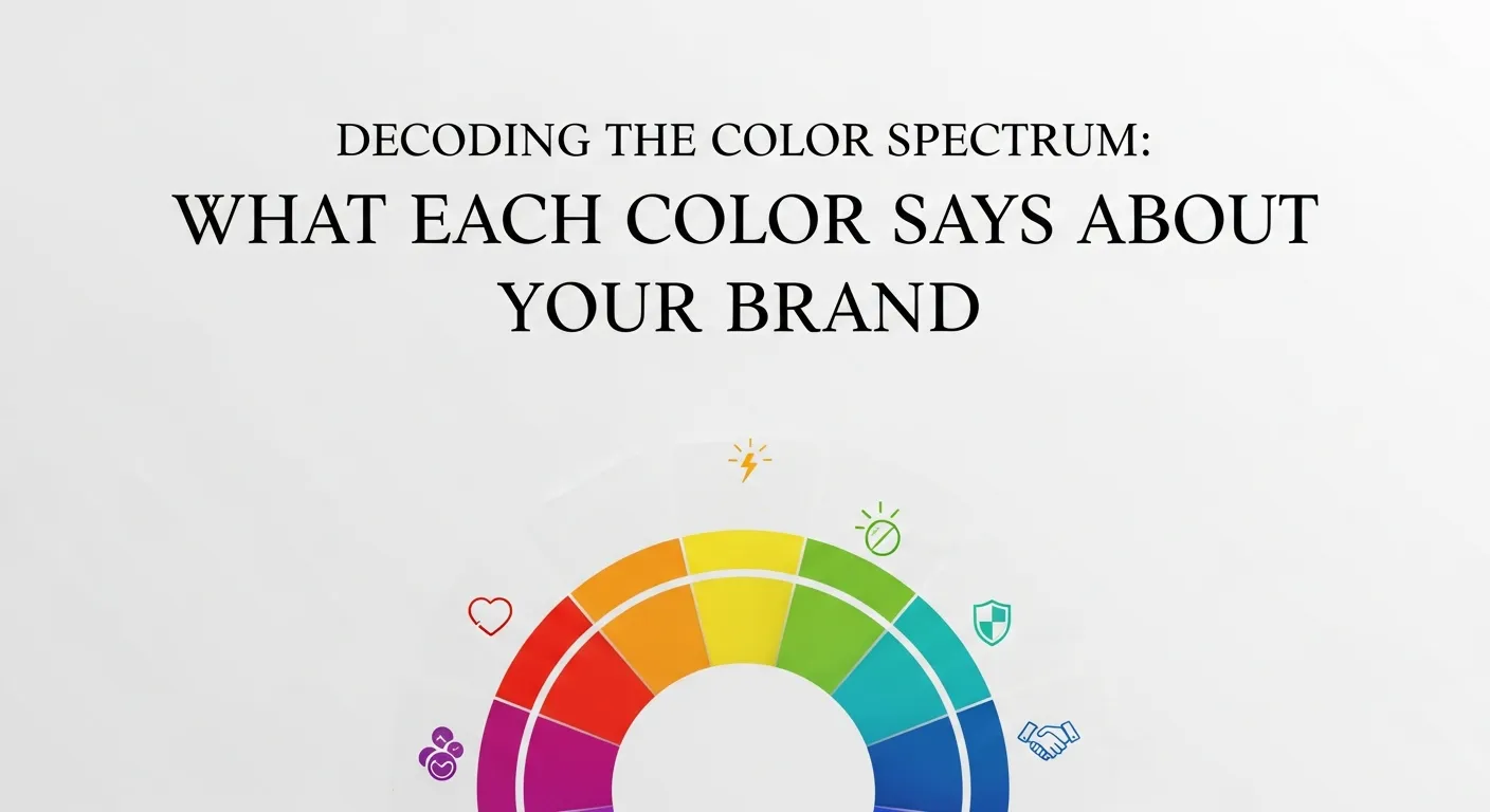
To effectively use Color Psychology in Branding, marketers must understand the specific associations linked to each color. While these can vary based on context and culture, there are general universals in The Psychology of Color in Branding.
Red: Power, Passion, and Urgency
Red is a high-arousal color. It stimulates the appetite, which is why it’s a staple in CPG Brand Marketing for food and beverage companies like Coca-Cola and McDonald’s. It also creates a sense of urgency, making it perfect for clearance sales and “Buy Now” buttons.
- Brand Personality: Bold, energetic, youthful, exciting.
- Best for: Food, entertainment, sports, and clearance sales.
Blue: Trust, Security, and Logic
Blue is the world’s favorite color and a pillar of corporate identity. It creates a sense of stability and reliability. Tech giants like Facebook, Dell, and IBM use blue to communicate trust and intelligence. It is crucial for Brand Safety in Digital Marketing, assuring users their data is secure.
- Brand Personality: Trustworthy, dependable, secure, responsible.
- Best for: Finance, technology, healthcare, and insurance.
Yellow: Optimism, Clarity, and Warmth
Yellow captures attention like no other color. It is associated with the sun, happiness, and energy. However, it can also signal caution (think traffic lights). In Brand Marketing, it is often used to grab attention in window displays or to highlight key information.
- Brand Personality: Optimistic, cheerful, playful, confident.
- Best for: Fast food, construction, and brands wanting to evoke happiness.
Green: Nature, Growth, and Health
Green is synonymous with nature and money. It is the dominant color for Green Marketing and Sustainable Branding Strategies. It has a calming effect and is the easiest color for the eye to process. Brands like Whole Foods and Starbucks use green to signal freshness and ethical sourcing.
- Brand Personality: Peaceful, healthy, organic, wealthy.
- Best for: Health, finance, environment, and wellness.
Purple: Luxury, Wisdom, and Creativity
Historically associated with royalty, purple implies luxury, quality, and authenticity. It is often used in Luxury Brand Marketing for anti-aging products or high-end chocolates (like Cadbury). It also has a spiritual or creative connotation.
- Brand Personality: Imaginative, wise, luxurious, spiritual.
- Best for: Luxury goods, beauty, and creative agencies.
Black: Sophistication, Authority, and Substance
Black is powerful and sleek. It is a staple in Luxury Brand Marketing (Chanel, Gucci) because it communicates exclusivity and high value. It creates a perception of weight and seriousness.
- Brand Personality: Powerful, sophisticated, edgy, prestigious.
- Best for: Luxury fashion, automotive, and technology.
White: Purity, Cleanliness, and Simplicity
White represents minimalism and cleanliness. It is heavily used in Brand Simplification strategies, particularly by tech companies like Apple, to suggest modern, efficient design.
- Brand Personality: Pure, clean, modern, simple.
- Best for: Technology, healthcare, and charities.
Neuromarketing Techniques: The Brain on Color
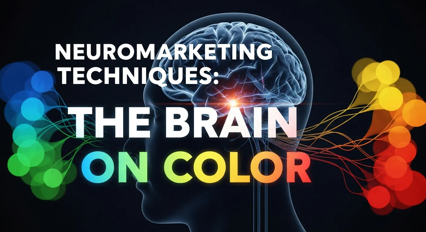
Neuromarketing in Branding: Using Psychology to Influence Buyers takes color theory a step further by using science to track physiological responses.
- Eye Tracking: Studies show that consumers look at color first, then shapes, then numbers, and finally text.
- Emotional Mapping: Different shades of the same color can evoke vastly different responses. A bright neon green might signal “cheap” or “artificial,” while a deep forest green signals “expensive” and “natural.”
- Sensory Congruence Mapping: This ensures that the color matches the expectation of the scent or taste. If a drink is colored red but tastes like mint, the sensory disconnect creates a negative brand experience.
Cultural Nuances in Color Psychology
Global Brand Localization requires a deep understanding of how colors are perceived differently across cultures. A color that signifies luck in one country might signify mourning in another.
- White: In Western cultures, it represents purity and weddings. In many Eastern cultures, it represents death and mourning.
- Red: In China, red is the color of luck and prosperity. In some African nations, it can represent death.
- Purple: In Brazil, purple is often associated with funerals.
Failing to account for these nuances can lead to a Brand Crisis Management nightmare. When expanding globally, a Comprehensive Brand Audit must include a cultural color check.
Color and Brand Identity: Developing a Palette
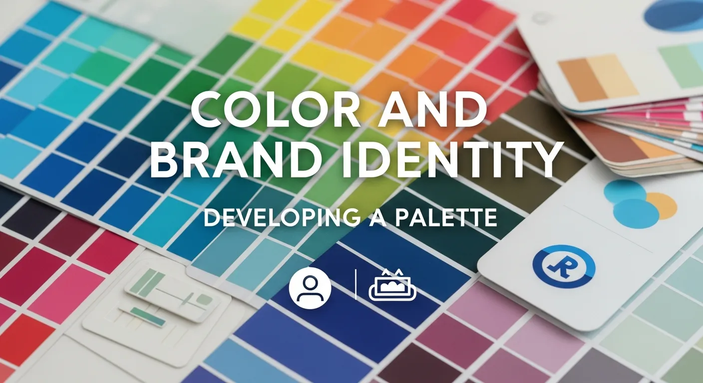
Creating a brand palette is not just about picking colors you like; it’s about strategic alignment with your Brand Archetypes.
The 60-30-10 Rule
A common rule in design is the 60-30-10 rule:
- 60% Primary Color: This is the dominant color that sets the tone.
- 30% Secondary Color: This supports the primary color and adds visual interest.
- 10% Accent Color: This is used for calls to action (CTAs) and highlights.
Integrating Color into Brand Architecture
For companies with multiple product lines, Brand Architecture: Organizing Your Portfolio for Maximum Market Impact is critical. You might use a master brand color (e.g., FedEx Purple) and distinct sub-brand colors (Orange for Express, Green for Ground) to differentiate services while maintaining Brand Equity.
Impact of Color on Conversion Rates (CRO)
Color Psychology in Branding has a direct impact on the bottom line. It plays a massive role in Digital Marketing Strategies and Conversion Rate Optimization (CRO).
- CTA Buttons: Changing a CTA button from green to red has been shown to increase conversions by 21% in some A/B tests. However, context is key. The button must stand out from the background (the “Von Restorff Effect”).
- Trust Indicators: Using blue in trust seals and guarantee icons increases user confidence during checkout.
- Readability: High contrast between text and background improves readability and accessibility, a key component of the Ultimate Guide to Brand Accessibility.
Color in Digital vs. Physical Environments
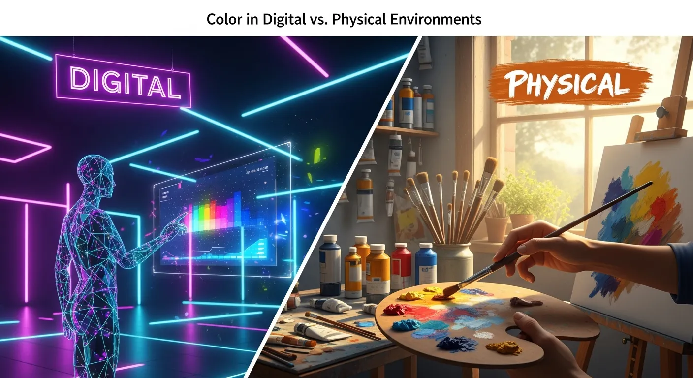
The application of Color Psychology in Branding differs between digital screens and physical packaging.
- RGB vs. CMYK: Marketers must understand the difference. Digital screens use RGB (Red, Green, Blue) which emits light, making colors appear more vibrant. Print uses CMYK (Cyan, Magenta, Yellow, Key/Black) which reflects light.
- Consistency: Building Brand Consistency Across Digital and Physical Touchpoints is challenging but essential. A specific shade of “Tiffany Blue” must look the same on an iPhone screen as it does on a shopping bag.
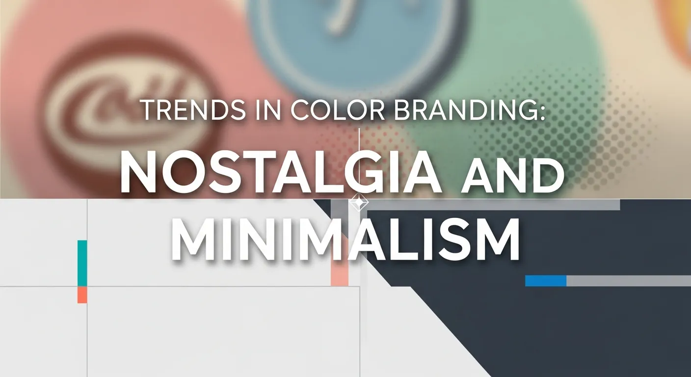
Trends in Color Branding: Nostalgia and Minimalism
Current trends in Color Psychology in Branding are shifting towards two extremes:
- Nostalgia in Digital Branding: Brands are using retro, muted palettes (mustard yellows, burnt oranges) to evoke a sense of comfort and the “good old days.” This is particularly effective for connecting with Millennials and Gen Z who crave authenticity.
- High-Contrast Minimalism: To stand out in “Dark Mode” on devices, brands are using neon accents against dark backgrounds. This creates a futuristic, tech-forward vibe suitable for Mastering Metaverse Branding.
Avoiding Mistakes: The Truth Behind Branded Sustainability
One of the pitfalls of Color Psychology in Branding is Greenwashing. This occurs when brands use green branding to appear eco-friendly without implementing actual sustainable practices.
The Truth Behind Branded Sustainability and Environmental Harm reveals that consumers are becoming skeptical. Just because a package is green or brown (signifying recycled paper) doesn’t mean it’s sustainable. Brands must back up their color choices with transparent action to maintain Brand Authenticity.
Implementing Color Psychology in Your Strategy
To leverage Color Psychology in Branding effectively, follow this roadmap:
- Define Your Brand Personality: Are you a rugged “Explorer” or a caring “Mother”? Use the Big 5 Model of Brand Management (Sincerity, Excitement, Competence, Sophistication, Ruggedness) to define your traits.
- Analyze Competitors: Conduct a Competitive Brand Analysis. If every competitor uses blue, choosing orange can offer Brand Distinctiveness and Salience.
- Test with Focus Groups: Use A/B testing and Neuromarketing Branding Guide principles to see how your audience reacts to different palettes.
- Create a Brand Style Guide: Document your color codes (Hex, RGB, CMYK, Pantone) to ensure Integrated Brand Promotion across all channels.
The Role of Color in Inclusive Brand Strategies
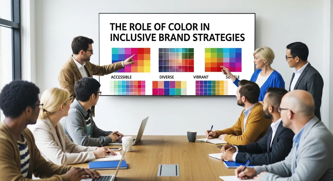
Inclusive Brand Strategies demand that color choices be accessible to everyone, including those with color vision deficiencies (color blindness).
- Contrast Ratios: Ensure sufficient contrast between text and background.
- Don’t Rely Solely on Color: Never use color alone to convey meaning (e.g., “Click the red button”). Always use text labels or icons alongside color cues. This is vital for Brand Safety in Digital Marketing.
Future of Color: AI and Personalization
AI Sensory Branding is revolutionizing how we use color.
- Generative Engine Optimization: AI tools can now generate dynamic color palettes that adapt to a user’s preference or the time of day.
- Hyper-Personalized Branding: Imagine a website that subtly shifts its color scheme based on the user’s browsing history or mood. Brand Voice in the Era of Conversational AI and Chatbots will soon be joined by “Brand Visuals” that adapt in real-time.
Conclusion
Color Psychology in Branding is a fundamental element of modern marketing that goes far beyond “making things look pretty.” It is a strategic tool that influences Brand Perception, drives emotional engagement, and guides purchasing decisions. By understanding the psychological and cultural implications of color, leveraging Neuromarketing Techniques, and maintaining consistency across all touchpoints, marketers can build brands that resonate deeply and drive long-term loyalty. Whether you are launching a new product or undergoing a Rebranding, color should be at the heart of your strategy.
FAQs
1. What is Color Psychology in Branding?
Color Psychology in Branding is the study of how colors affect perceptions and behaviors regarding a brand. It explores how specific hues can evoke emotions (like trust or excitement) and influence consumer decisions, playing a crucial role in Brand Identity and marketing strategy.
2. How does color influence purchasing decisions?
Color can influence up to 90% of an initial impression. It helps consumers quickly identify if a product aligns with their needs. For example, orange often triggers impulse buys (clearance items), while blue builds trust for high-value purchases like insurance.
3. What is the best color for a “Call to Action” (CTA) button?
There is no single “best” color, but high-contrast colors like red, orange, and green generally perform best because they stand out. The key is the “pop” effect against the background color. A/B testing is essential to determine what works for your specific audience.
4. How do I choose the right colors for my brand?
Start by defining your Brand Personality (e.g., sophisticated, playful, rugged). Then, look at the color meanings that align with those traits. Conduct a Competitive Brand Analysis to see what colors are common in your industry and decide if you want to blend in or stand out.
5. Can using the wrong color hurt my brand?
Yes. Using a color that conflicts with your message causes cognitive dissonance. For example, a financial advisor using bright neon pink might be perceived as frivolous or untrustworthy. Additionally, cultural misunderstandings regarding color meanings can damage Global Brand Localization efforts.
6. What is the difference between RGB and CMYK in branding?
RGB (Red, Green, Blue) is for digital screens (websites, social media) and relies on light. CMYK (Cyan, Magenta, Yellow, Black) is for print materials (business cards, packaging) and relies on ink. Knowing the difference ensures Brand Consistency across digital and physical mediums.
7. How does color affect Brand Recognition?
Consistent use of a signature color can increase Brand Recognition in Marketing by 80%. Think of “Coca-Cola Red” or “Starbucks Green.” Over time, the color alone becomes enough to identify the brand, creating strong Brand Equity.
8. What role does color play in Green Marketing?
Green is the dominant color in Green Marketing because it signifies nature and health. However, brands must be careful of Greenwashing—using green branding to fake sustainability. Brown (earthy tones) and white (minimalism) are also popular in Sustainable Branding Strategies.
9. How can I ensure my brand colors are accessible?
Follow the Ultimate Guide to Brand Accessibility by checking color contrast ratios to ensure text is readable for people with visual impairments. Tools like the Web Content Accessibility Guidelines (WCAG) provide standards for contrast. Avoid color combinations that are hard for color-blind users to distinguish (like red/green).
10. What is the future of color in branding?
The future lies in AI Sensory Branding and dynamic personalization. AI will allow brands to test thousands of color variations in real-time and even adapt interfaces to individual user preferences. Augmented Reality Branding will also allow consumers to visualize products in different colors in their own environment before buying.


